![Logo]()
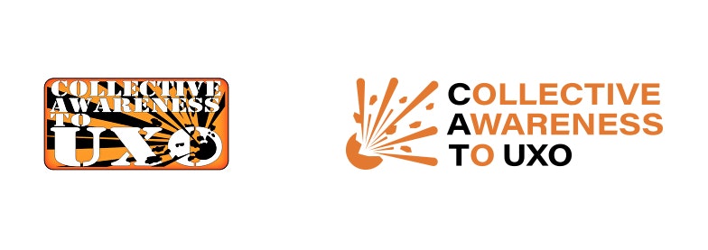
Brand refresh before (left) and after (right)
Background
Collective Awareness to Unexploded Ordnance (CAT-UXO) aims to bring together the explosive ordnance disposal (EOD) community.
We are working with CAT-UXO to improve the design, user experience and overall functionality offered to the EOD community through the CAT-UXO website – CAT-UXO website case study.
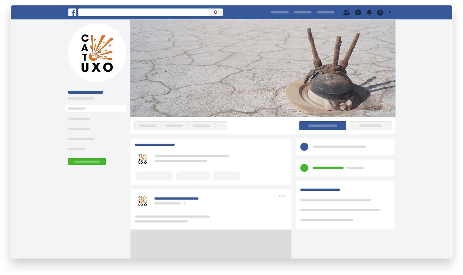
We’ve created a clean user interface and simple user experience that was being aged by the existing CAT-UXO brand. It’s for that reason we worked with CAT-UXO to refresh the brand and bring it inline with our efforts on the website which we think you’ll agree now work well together, check it out on the CAT-UXO website.
Our Approach
- Focusing on their target audience
- Maintaining the value of the subject matter as it’s very sensitive and needs to be heavily supported by social media
- Making sure we tailor to a specialist service
- Keeping the hazard symbol within the logo type
![Logo]()
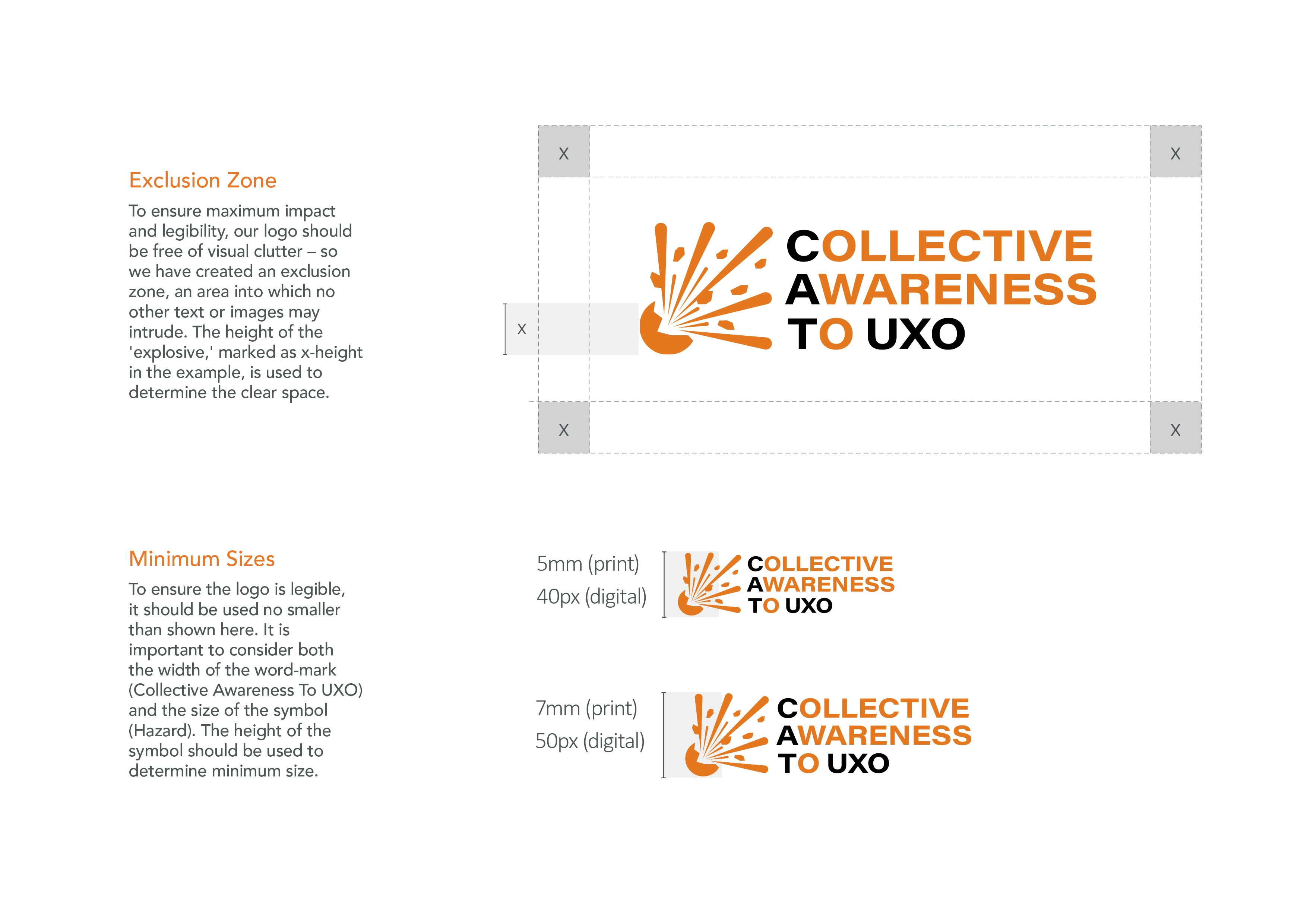
CAT-UXO Logo Usage
The Execution
We tried a number of different options to take CAT-UXO to the next level. The key element was to keep and refresh the hazard symbol as this is how the brand has been recognisable since its inception. The new logo was tested with a closed group from our clients social media following using a voting system to help influence the direction from real contributors.
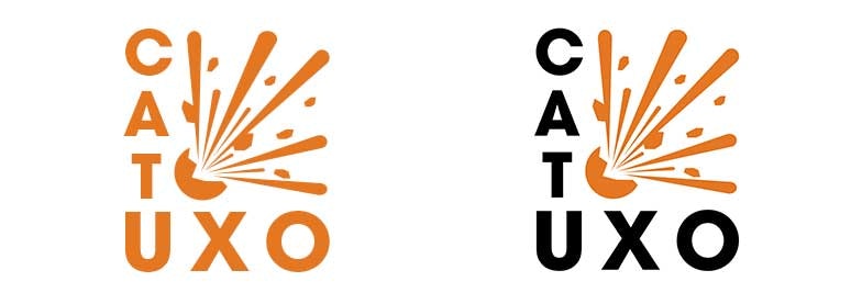
After a short period of working very closely together we were very happy with the outcome and created two variants, a linear and stacked version of the logo to give our client more versatility when using the logo.
![Logo]()
Stacked Version of the logo
![Logo]()
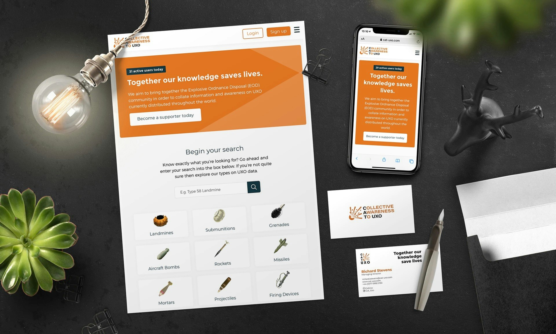
Website & Business cards redesign
![Logo]()
Social presence
![Logo]()
InDesign, Illustrator, Adobe Acrobat

