🕘
We re-open on Monday
02381 680 014

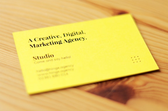
Shiny new business cards just in time for the New Year.

As Hinge shares its new brand identity with the world it’s important for us to deliver this message to our clients and future clients, what better way to do this than with our newly designed business cards.

We’ve recently brought branding and print services in-house Stephanie had the opportunity to use her extensive knowledge and experience by designing and sourcing print.

Logo

The process

Choosing paper stocks is the most important aspect of any printed marketing collateral as you want the end user to touch and feel a quality end product. Stephanie has many contacts within the industry and by meeting up with them and reconnecting as part of Hinge it was soon decided that she wanted to find a yellow stock to match our brand in order for our business cards to stand out.

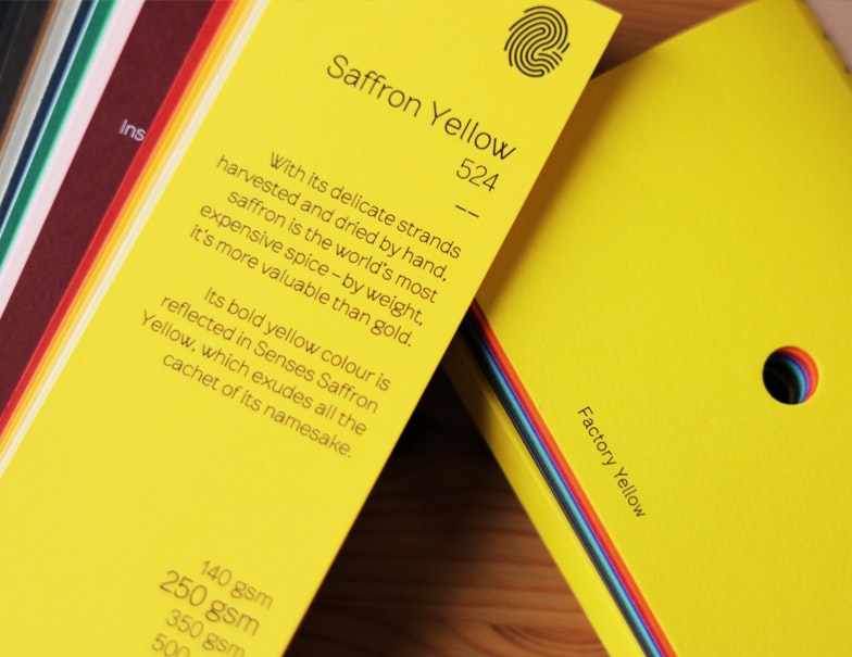
If you’ve ever looked for yellow stocks it can be quite tricky. There were two stocks that stood out for us that were as close to our brand yellow as we could possibly get. The two stocks that we shortlisted were ‘Saffron Yellow’ from the senses range and ‘Factory Yellow’ from the Colourplan range – a popular stock from GF Smith.

Logo
Saffron Yellow - Senses Range / Factory Yellow - Colourplan

After a group huddle we decided to go with ‘Saffron Yellow’ from the Senses range as the colour reflected our brand and us as an agency the best. Stephanie wanted the design to stand out, she didn’t want to use any ink and instead wanted de-boss and foil the business cards.

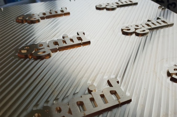
‘WOW’ was the impact she and the rest of the team wanted to achieve and once we received these images from our supplier we were very excited to see the end result.

Logo
Logo
Specially commissioned de-bossing and foiling tool.

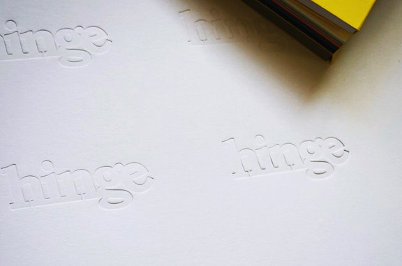
The business cards were originally going to a white front and a yellow back, we found though that the white stock wasn’t soft enough and the de-boss wasn’t as impactful as we’d hoped.

This could easily be resolved by using a cotton stock with less dense fibres, the problem however is that all of the cotton stocks available were more of an off white / cream which didn’t reflect our clean, crisp brand identity.

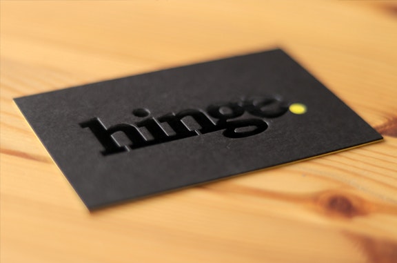
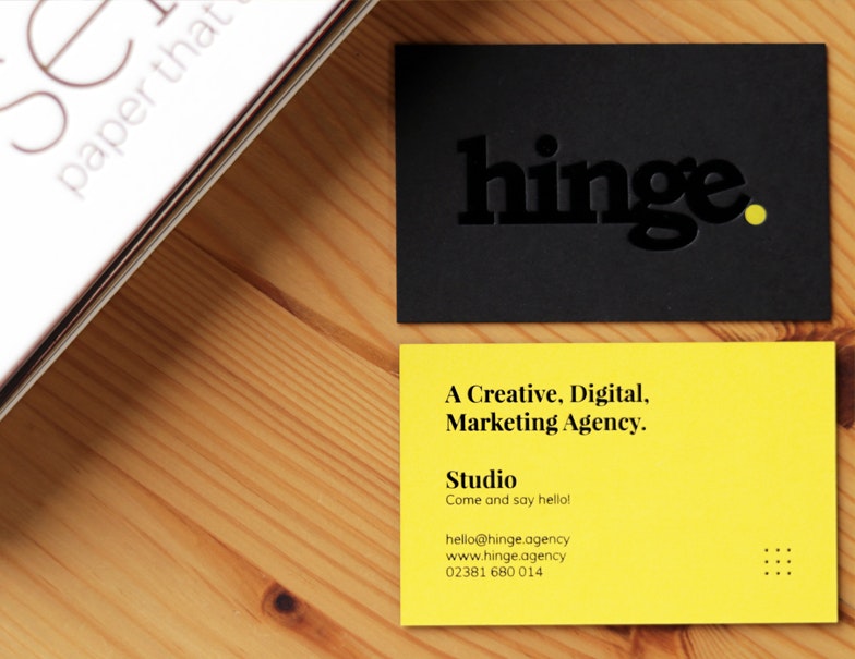
As a team we looked over all of our options and we decided to change direction and go with a black front. Our logo would still be de-bossed with black and yellow foil but it would have a deeper de-boss which is the effect we wanted to achieve so that you pick them up and automatically run you fingers across the logo.

Stephanie says

“The design is very simple but I wanted the card to ooze quality by using a unique printing processes that you can’t buy ‘off the shelf’. To me, bringing with me knowledge and experience in branding & print it was important that the business cards weren’t ordinary, I think we achieved this with the de-bossing, foiling and duplexing of two different paper stocks.”

Logo
Logo

Overall we’re over the moon with the final product and can’t wait to start handing them out.

If you need help with your own business cards get in touch today and we’ll help yours make an impact when you hand them to potential clients and customers!

LETS GO

Forward, Faster, Together.

Schedule a callback