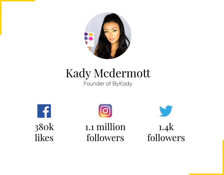
Love Island and TOWIE Star Kady McDermott recently shared on Instagram that she was looking for graphic designers to help with the design of her latest product – a makeup palette of eyeshadows.
Although we’re well qualified in graphic and print design they are services we’ve only recently introduced to Hinge. Stephanie, our Senior Creative & Brand Manager also happens to be a massive Love Island and TOWIE fan. So she reached out to see if we could help, the aim of course to grow our client base and be able to write this very case study… You’re reading this so that means we won the pitch to move forward with the new product packaging!
Kady has over 1.1 million followers so we’re sure she was inundated with creatives looking to get their work seen by millions of people, naturally we were over the moon when we received the email to confirm that our concept work had been selected and that we’d be moving forward to help Kady design the new packaging.
Once we’d been selected as their partner to design the new products packaging we were provided with a very simple brief.
- New Eyeshadow Palette Cover Artwork
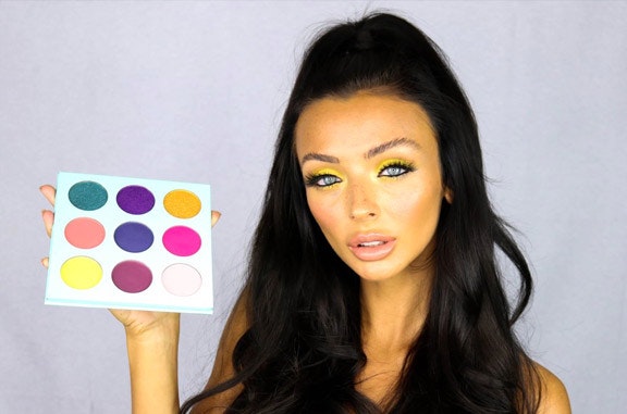
- Palette is Mint Green 14.5cm x 14.5cm
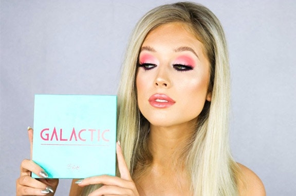
- Name of the Palette – Galactic
- Palette must include name of Palette and By Kady logo
The Process
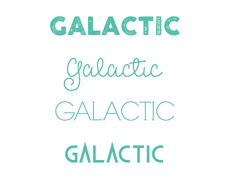
Before getting started we carried out some research on the word Galactic – the new product name – to get an understanding and feeling for the word in its own right.
We had a very tight deadline for the first round of design concepts and for good reason, the packaging design needed to be signed off and be with the printers ready for print within just a couple of days to give Kady’s team enough time to prepare for their Black Friday product launch!
The initial concepts explored the galaxy look and feel where we made suggestions of different print finishes such as gold foiling and embossing of the stars to bring that galaxy feeling to life. We weren’t going to be printing the package design but wanted to give examples of how it could be presented.
![Logo]()
Initial typography concepts
Kady loved the initial direction in which the design was going but asked to see some ideas that made use of one of the other typefaces that we identified during our research. In print it’s so important that we present a variety of options in order to explore lots of possibilities and we were more than happy to use and implement Kady’s suggestions, again presenting a few examples and possibilities.
Kady was really happy with the way the typography was set and asked that we placed it on a plain mint green background with her logo in bright pink and with that we had signed off on the new package design for hew new product.
![Logo]()
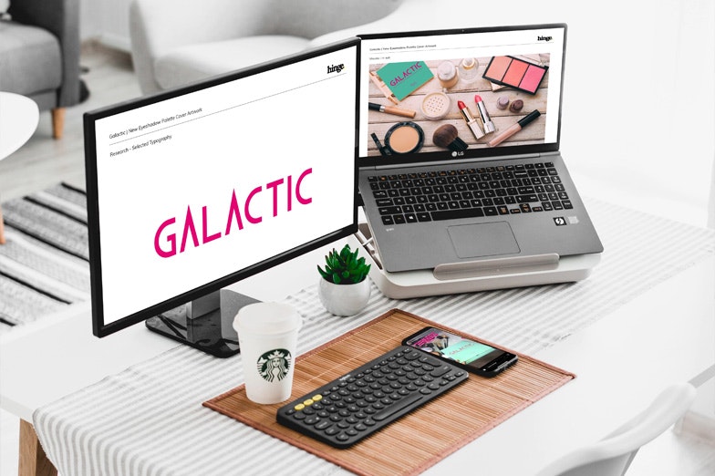
Packaging design concepts as presented to Kady
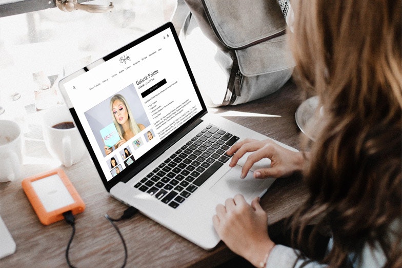
Since finalising and providing print ready artwork to Kady and her team they have gone on to launch the new Galactic Palette that is now being sold via her website and promoted through her social media channels.
![Logo]()
Galactic Palette sold online at bykady.com