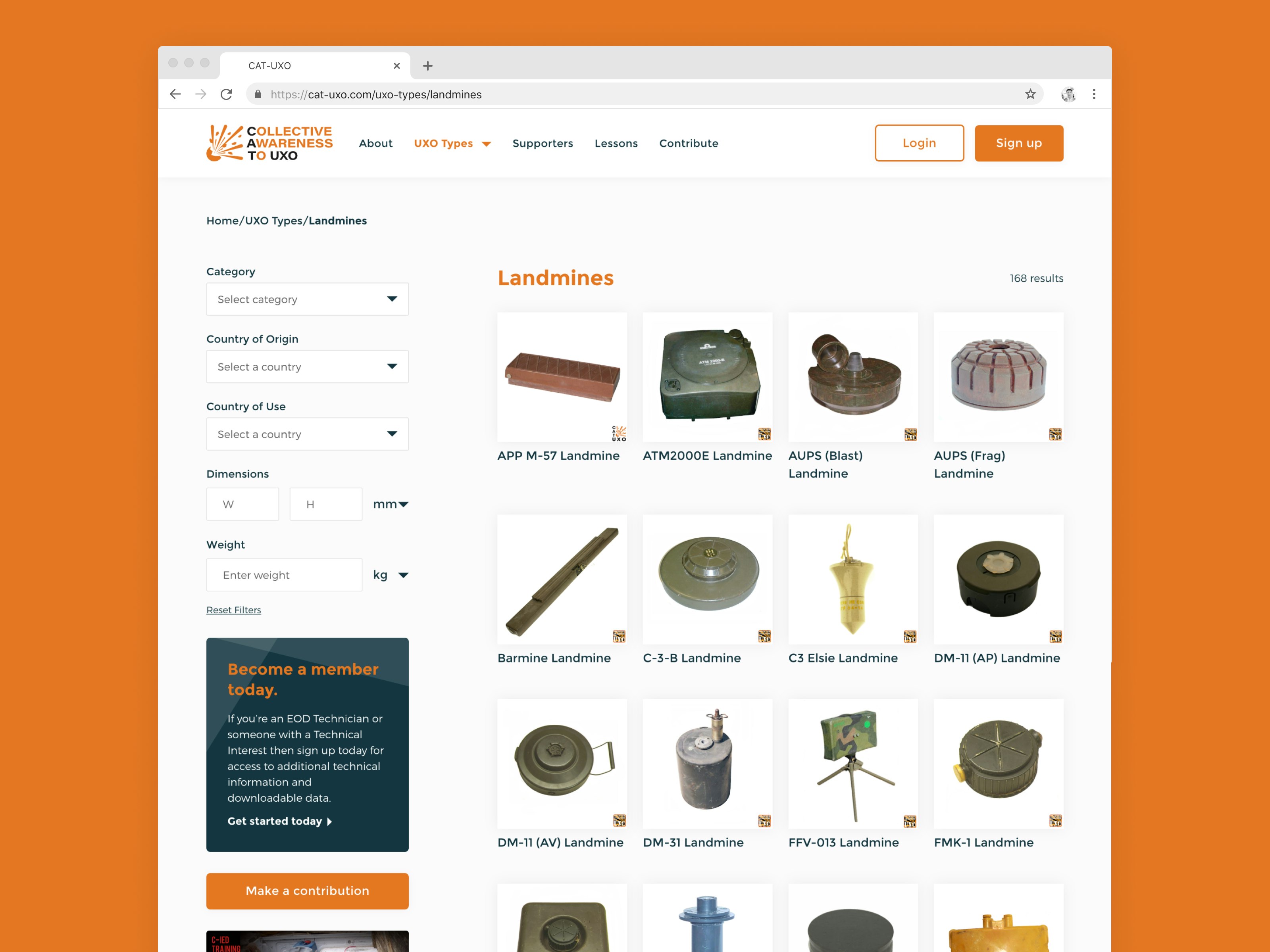
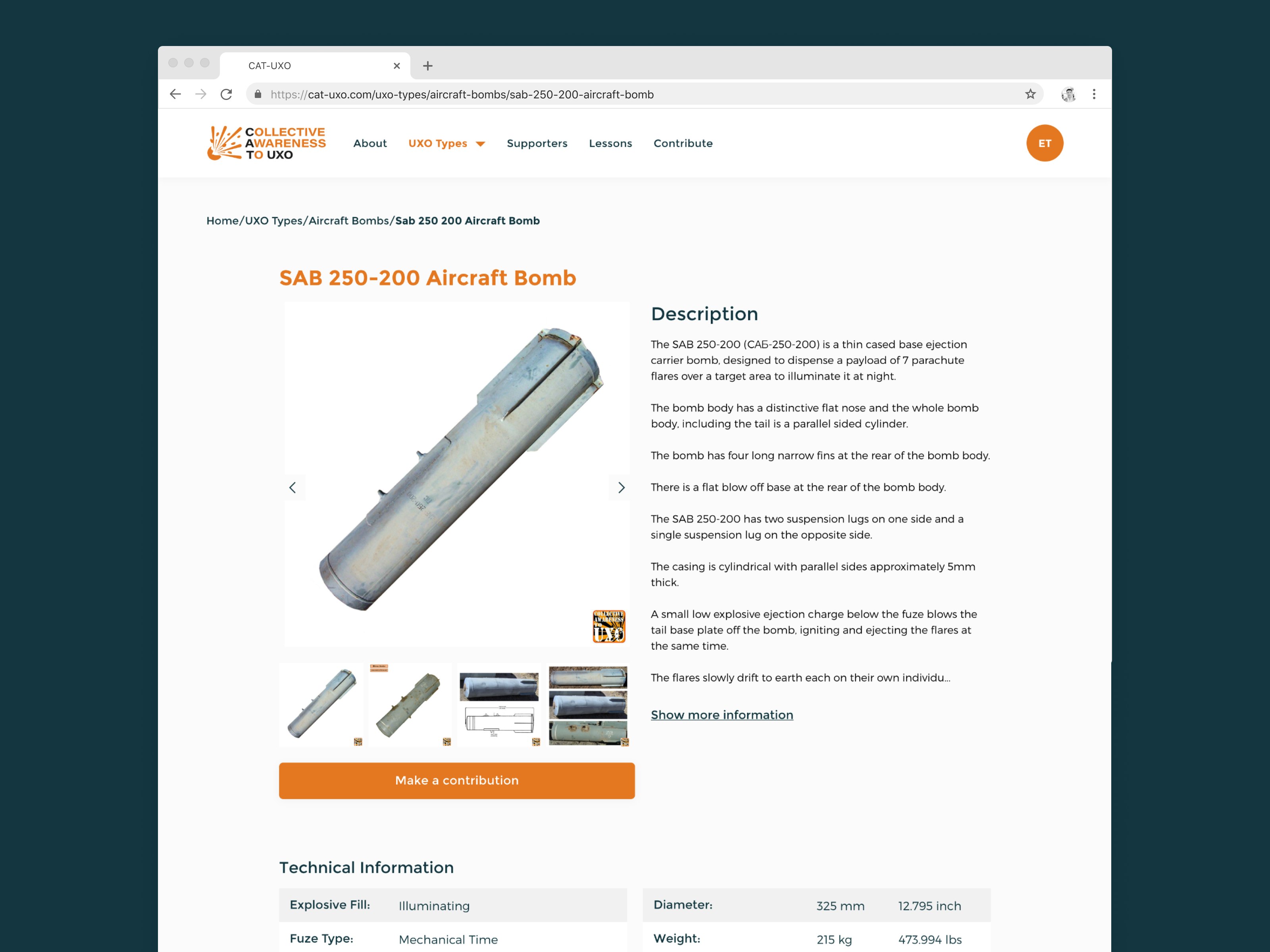
This project has been about redesigning the CAT-UXO website in order to bring together the Explosive Ordnance Disposal (EOD) community, allowing them to contribute data easily and research technical data in an intuitive way. During this process, we also worked on rebranding CAT-UXO to make it feel modern and in line with its target audience.
Having worked with Richard from CAT-UXO on creating two cross-platform apps previously, we couldn’t wait to get started on this next project!
Existing Website
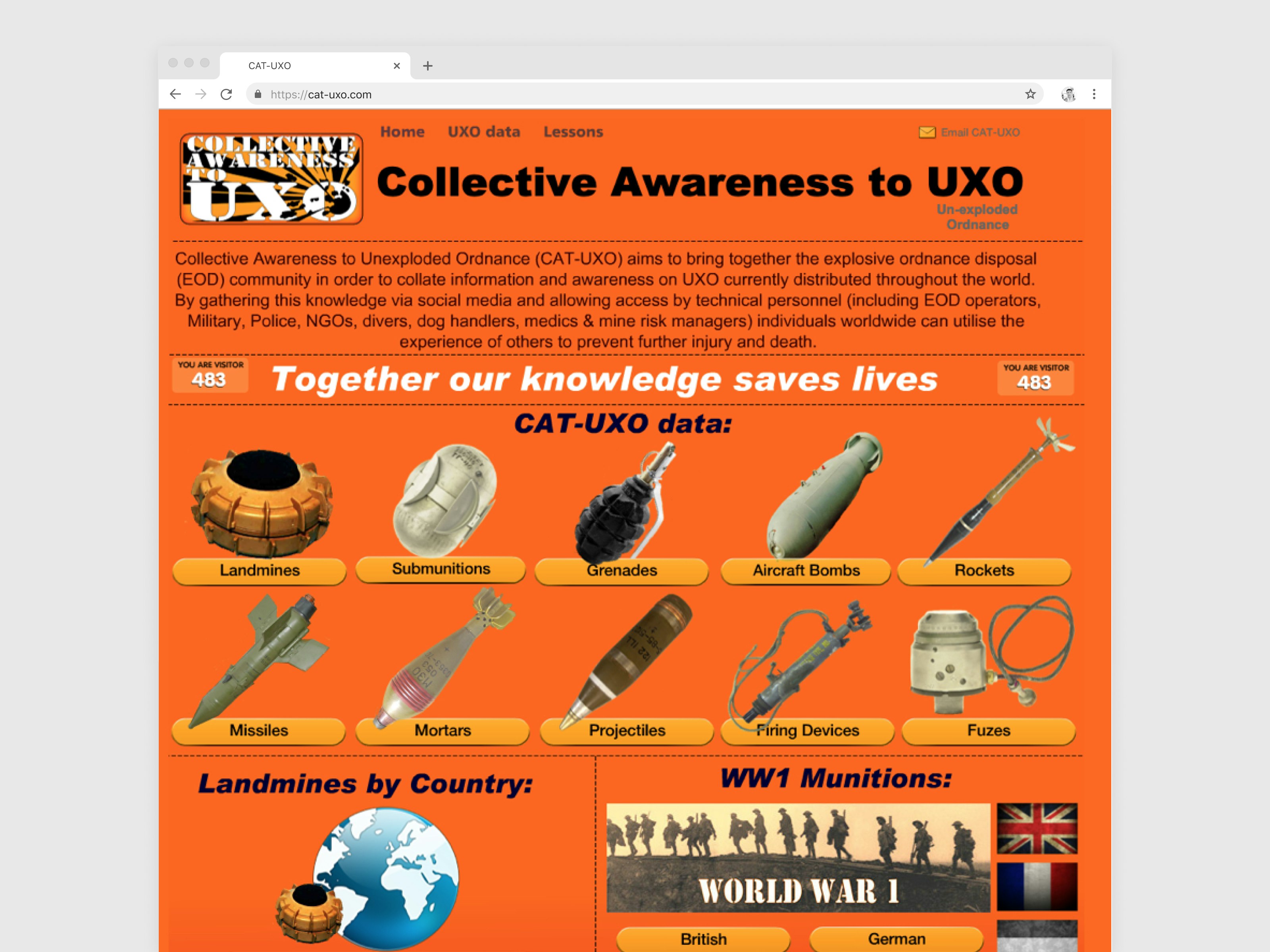
Let’s start off by taking a look at the existing CAT-UXO website that Richard has been uploading his content to over the last few years. The website was built using a Site Maker tool – a flash-based site builder, which as you can imagine has been a tedious process when it comes to updating and maintaining content. The site was only functional when the users turned on flash on the browsers which is not the case anymore in most modern browsers. The content was also locked into the legacy system with no way to re-use the content added to the site.
Luckily when working with CAT-UXO previously we had already made great improvements to the data entry process. The same database for the apps was going to be used for this website, with some minimal modification for additional features and data consistency between the website and the apps.
![Logo]()
CAT-UXO Old Website
As you can see, the website was in need of a redesign to make it look modern and improve the experience of users being able to find/contribute data, especially as we are introducing paid-for subscriptions!
Data Structure & User Types
Before getting into any wireframes we needed to look at the different levels of data that existed for each category. We soon identified that there was no consistency in the structure and number of levels of data. Our aim was to allow users to filter through data on the website, however, this was proving difficult when there were overlapping filters.
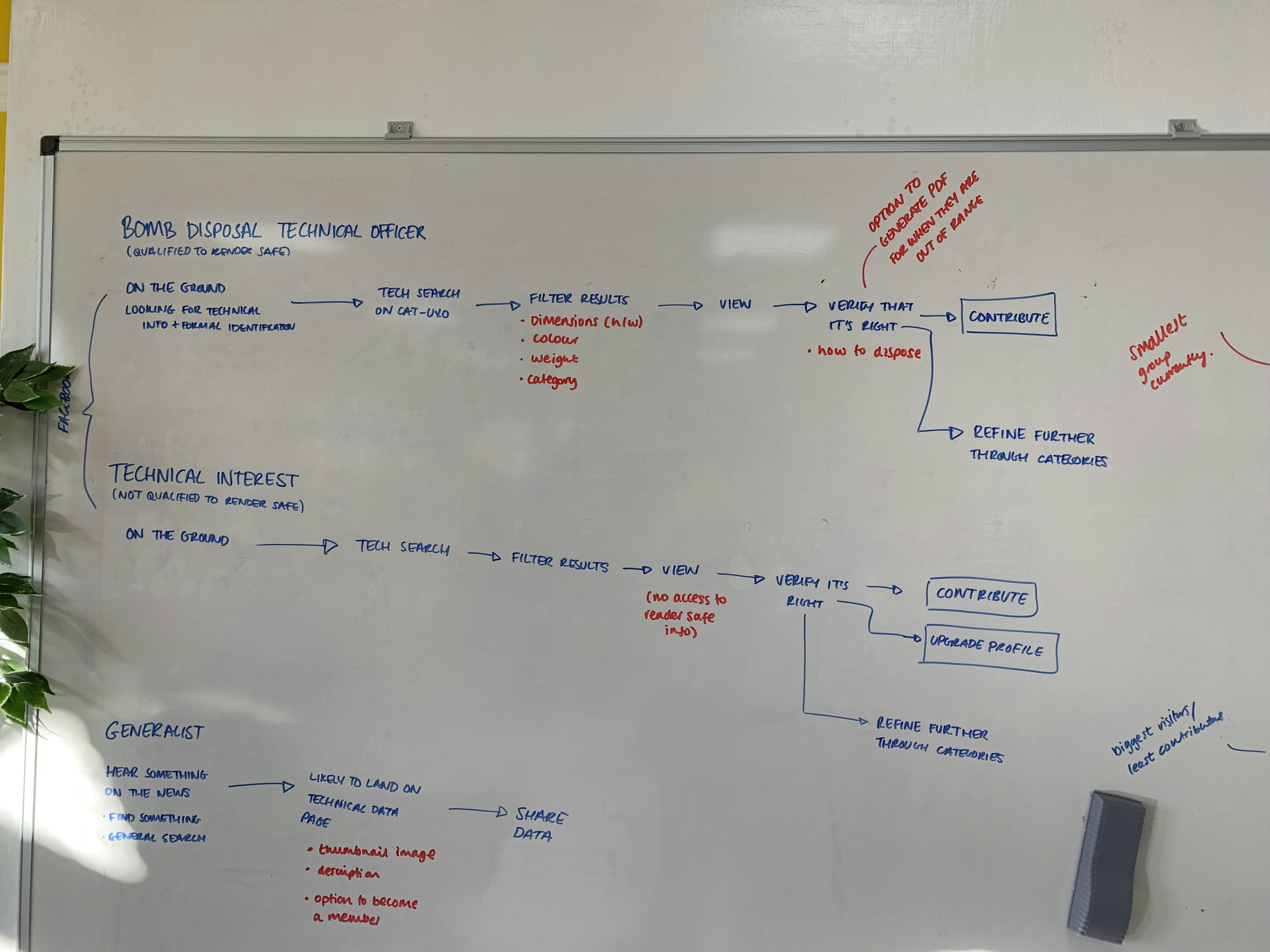
During our kick-off project for this workshop we identified the different types of users that would be coming to the website. We narrowed this down to:
- General Public
- Technical Interest
- Technician
![Logo]()
Kick Off Workshop - User Journey's
The main user types we needed to concentrate on were ones of Technical Interest and Technicians. These two users types would be able to access different types of information based on their profession. As a general public user, you’d be able to see basic information and have no ability to contribute whereas Technical Interest and Technician would need to pay a subscription fee to CAT-UXO in order to access different levels of technical information and contribute.
Wireframes & Design
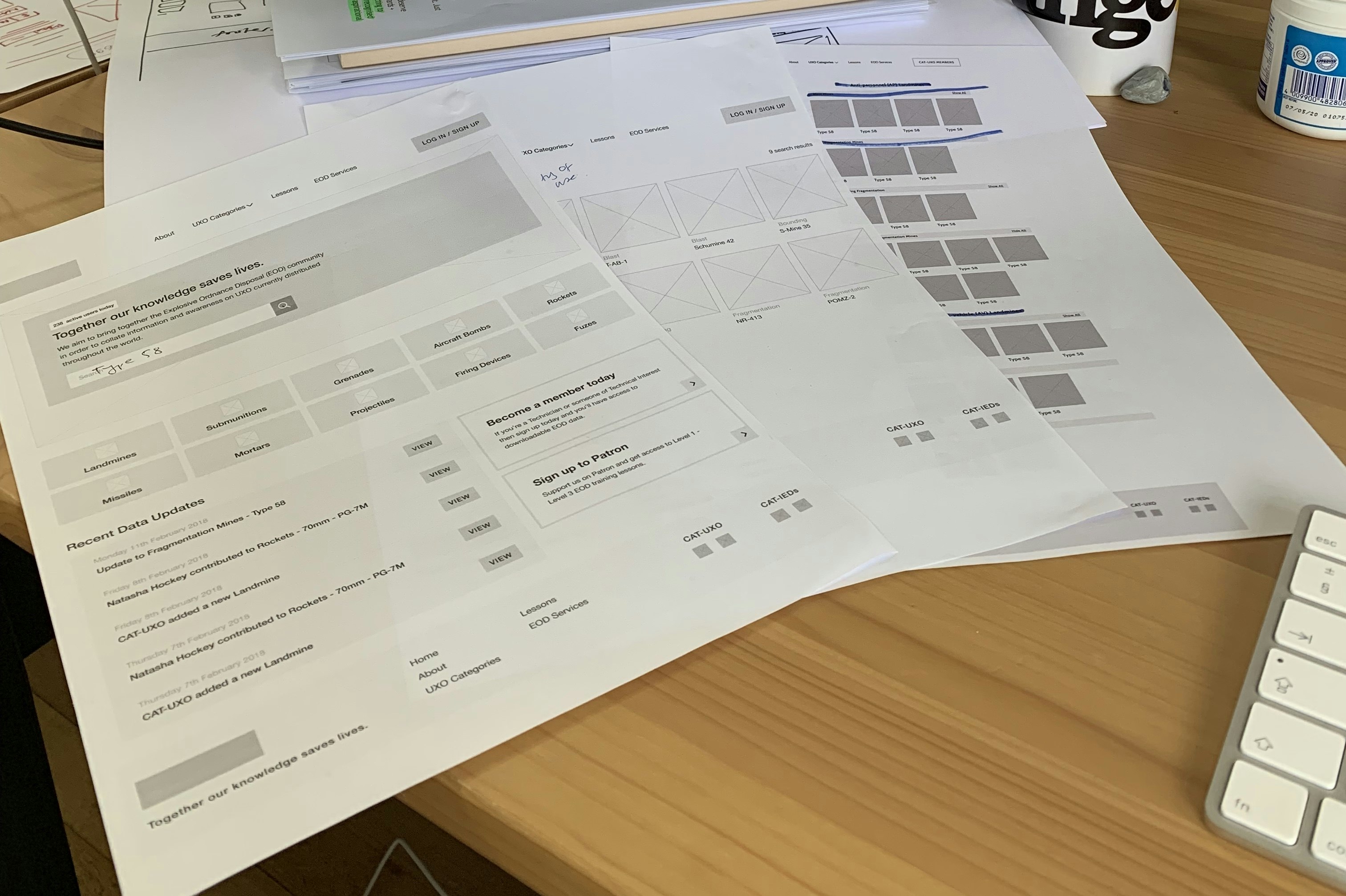
Once we had identified the data structure and different levels of user types we then started wireframing. After this initial round of wireframes, we presented them to Richard in the form of a clickable prototype so that CAT-UXO could get a feel for the Information Architecture and User Experience. Based on client feedback we then went through another iteration until both parties were happy and we could move forward into the design phase.
![Logo]()
CAT-UXO Website Wireframes
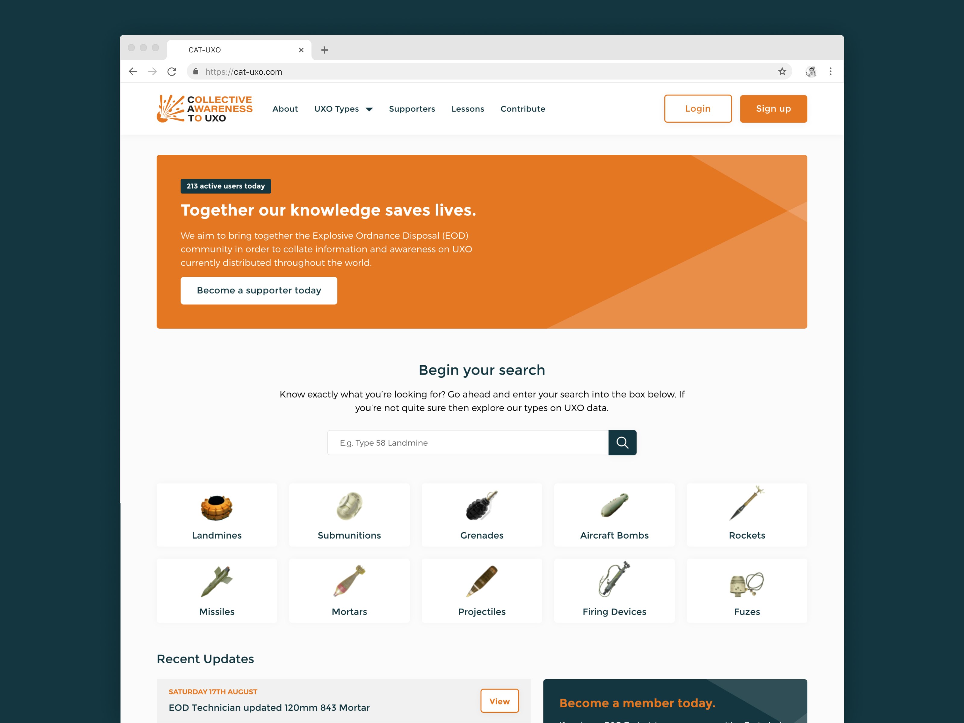
With any project that we work on we aim to make all styling and components as reusable as possible. This is to create consistency across the website both visually and for the codebase. CAT-UXO has many reusable components which are flexible and versatile.
![Logo]()
Larvel, Vue, MySQL, Vuex, API Driven
You can view the redesigned CAT-UXO website here.

